Best Practices for Responsive Course Design in Lectora Inspire
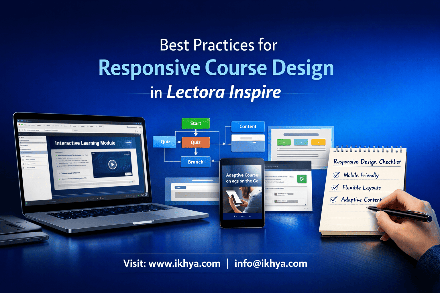
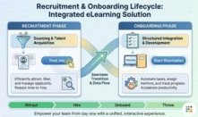
Creating effective eLearning courses today means ensuring learners can access content seamlessly across desktops, tablets, and smartphones. Responsive course design adapts layouts, interactions, and navigation to every device, giving employees a smooth learning experience no matter where they are. For organizations using Lectora Inspire, adopting best practices in responsive design can increase engagement, reduce drop-offs, and ensure training ROI.
Whether you are updating legacy courses, designing new modules, or considering multi-device deployment, this guide will help you understand the principles, strategies, and practical steps to deliver mobile-friendly, scalable, and accessible eLearning. You’ll also find real-world examples, timelines, and cost insights for effective planning.
If you’re ready to see responsive learning in action, you can explore a free Lectora Inspire demo to understand how your courses can look across all devices.
Introduction to Responsive Course Design in Lectora Inspire
Responsive course design ensures your eLearning adapts dynamically to different screen sizes and orientations. Unlike fixed-layout courses, responsive courses automatically adjust text, images, videos, and interactive elements for optimal viewing.
Key benefits include:
- Consistent learner experience: Courses work on any device without distortion or content loss.
- Increased accessibility: Compliance with accessibility standards like WCAG ensures all learners can access content.
- Future-proofing training content: Adaptable courses save time when new devices or OS updates are released.
Why Lectora Inspire?
- It offers built-in responsive templates and multi-device preview tools.
- Supports SCORM/xAPI compliance, ensuring LMS integration works seamlessly.
- Provides options for adaptive learning paths, interactive assessments, and mobile-friendly navigation.
Practical Tip: Start with a mobile-first mindset. Design your course for small screens first, then scale up to tablets and desktops. This approach prevents layout issues and enhances usability.
Why Responsive Design Matters for Modern Learners
In today’s fast-paced work environment, learners access training from multiple devices—whether at their desk, on a tablet during travel, or on a smartphone during breaks. Designing courses that respond to these varied environments is no longer optional; it’s critical for engagement and retention.
Key reasons responsive design matters:
- Flexibility for learners: Employees can complete training anytime, anywhere, without technical frustrations.
- Higher engagement and completion rates: Courses that adapt visually and functionally keep learners motivated.
- Compatibility with corporate LMS platforms: Responsive courses ensure smooth integration with SCORM- and xAPI-compliant systems.
Organizations looking to modernize their training programs can benefit from custom eLearning development services that include responsive course design. By leveraging such services, businesses ensure that content is optimized across multiple devices and accessible to a wider audience.
Practical Tip: Analyze your workforce’s most-used devices and plan course layouts to prioritize those screens first. Mobile-first design paired with Lectora Inspire development services ensures courses remain adaptive, interactive, and visually appealing.
Core Principles of Responsive eLearning
Creating effective responsive courses in Lectora Inspire requires adhering to foundational principles that ensure content adapts seamlessly across devices while maintaining learner engagement.
Mobile-First Design Approach
Designing for smaller screens first ensures critical content is prioritized, interactions remain intuitive, and layouts are optimized. Starting with mobile layouts prevents clutter on larger screens and improves usability across devices.
Key considerations:
- Use concise text and visuals.
- Optimize interactive elements for touch interfaces.
- Test layouts in both portrait and landscape modes.
Organizations can benefit from mobile learning development solutions to implement a mobile-first approach effectively.
SCORM/xAPI and LMS Compliance
Responsive courses must work flawlessly within Learning Management Systems (LMS) and track learner progress accurately. Using SCORM or xAPI ensures:
- Completion tracking
- Learner analytics
- Integration with corporate LMS dashboards
Leveraging LMS-compatible eLearning course development services ensures compliance and smooth reporting for enterprise deployments.
Accessibility Standards
Incorporating accessibility standards like WCAG guarantees that learners with disabilities can access content without barriers. This includes:
- Screen reader-friendly navigation
- Closed captions for audio/video content
- Color contrast and font readability adjustments
For enterprises, partnering with accessible eLearning solutions helps create inclusive, responsive courses that meet global accessibility requirements.
Practical Tip: Combine mobile-first design, LMS compliance, and accessibility from the start. This integrated approach reduces rework and ensures courses are scalable across devices and audiences.
Best Practices for Designing Multi-Device Courses
Designing courses that work seamlessly on multiple devices requires a balance of UI/UX design, interactivity, and technical planning. Following proven best practices ensures learners have a consistent and engaging experience across desktops, tablets, and smartphones.
Layout Optimization for Different Screens
- Use flexible grids and containers that adjust automatically to screen sizes.
- Prioritize essential content for smaller screens.
- Avoid overcrowding pages with text or visuals.
Adopting designing multi-device eLearning courses using Lectora Inspire helps organizations streamline layouts efficiently.
Interactive Elements and Engagement Tips
- Use touch-friendly buttons and hotspots for mobile devices.
- Incorporate microlearning modules to deliver information in short, digestible chunks.
- Add scenario-based interactions and quizzes to boost learner participation.
Companies can leverage microlearning development services to integrate short, interactive modules that maintain engagement across all devices.
Testing Across Devices
- Test courses on multiple devices, browsers, and screen resolutions.
- Validate functionality of media elements, navigation, and interactive components.
- Use analytics to track how learners interact with content on different devices.
Using rapid eLearning development using Lectora Inspire allows faster iteration and testing, ensuring responsive courses meet quality standards before deployment.
Practical Tip: Implement a device testing checklist early in development. Include tablets, smartphones, and desktops to identify layout or interactive issues before final release.
Lectora Inspire Features Supporting Responsive Design
Lectora Inspire provides a comprehensive toolkit to create responsive, multi-device eLearning courses efficiently. Leveraging its features ensures consistent learner experiences and reduces development time.
Built-in Templates and Themes
- Pre-designed responsive templates allow quick course setup.
- Themes automatically adapt to different screen sizes.
- Reduces design time while maintaining professional appearance.
Organizations can explore top features of Lectora Inspire for eLearning development to understand all template and theme options available.
Preview and Testing Tools
- Built-in device preview lets developers see how content appears on smartphones, tablets, and desktops.
- Supports testing different orientations (portrait vs. landscape).
- Detects layout issues early to prevent rework.
Using Lectora Inspire development services ensures expert handling of testing and preview workflows for enterprise-ready courses.
Multi-Device Publishing Options
- Export courses in SCORM, xAPI, or HTML5 formats for LMS integration.
- Supports offline and online access to meet varying learner needs.
- Optimized for modern browsers and mobile operating systems.
Companies can also refer to how Lectora Inspire enables responsive eLearning development to learn best practices for publishing across devices.
Practical Tip: Regularly preview your course during development on multiple devices to catch responsiveness issues early. This reduces QA cycles and ensures a polished learner experience.
Step-by-Step Development Framework
Developing responsive eLearning courses in Lectora Inspire requires a structured approach. Following a step-by-step framework ensures projects stay on schedule, meet learning objectives, and deliver consistent experiences across devices.
Planning and Storyboarding
- Define learning objectives and target audience.
- Map content into microlearning modules or interactive segments.
- Plan device-specific layouts and navigation flows.
Organizations can benefit from instructional design services to create detailed storyboards and course structures that align with corporate training goals.
Development & Asset Creation
- Use responsive templates and layouts provided by Lectora Inspire.
- Incorporate multimedia assets optimized for different devices.
- Include interactive elements like quizzes, drag-and-drop activities, and scenario-based learning.
Partnering with custom eLearning development services can help ensure high-quality content creation while maintaining responsiveness.
Testing, QA, and Deployment
- Test the course across all target devices and browsers.
- Validate SCORM/xAPI compliance for LMS tracking.
- Gather feedback from pilot users and iterate before final deployment.
For faster and more reliable delivery, rapid eLearning development using Lectora Inspire services can accelerate QA and deployment timelines.
Practical Tip: Break development into iterative sprints. Test early and often on actual devices to catch layout or interaction issues before full-scale deployment.
Vendor Selection & Outsourcing Strategy
Choosing the right approach for developing responsive courses in Lectora Inspire can significantly impact timelines, quality, and ROI. Organizations must decide between in-house development, outsourcing, or a hybrid model.
In-House vs Outsourced Development
- In-House: Full control over content and brand alignment; requires skilled instructional designers and Lectora experts.
- Outsourced: Access to experienced developers, faster delivery, and cost efficiency.
- Hybrid: Combines internal oversight with external development expertise for scalability.
For enterprises evaluating options, outsourcing Lectora Inspire eLearning development provides access to specialized teams with experience in responsive multi-device courses.
Questions to Ask a Lectora Vendor
- Do you provide mobile-first design and responsive testing?
- Can you ensure SCORM/xAPI compliance for LMS integration?
- What is your timeline for multi-device deployment?
- Can you handle accessibility and microlearning modules?
Engaging with vendors using a structured approach like lectora-inspire-development-process-for-enterprises ensures all technical and instructional requirements are met efficiently.
Cost and Timeline Estimates
- Small Module (2–3 screens, basic interactions): 2–3 weeks, $2,500–$4,000
- Medium Module (5–10 screens, interactive elements): 3–5 weeks, $4,000–$7,000
- Complex Module (multi-device, multimedia, assessments): 6+ weeks, $7,000–$10,000+
Referencing cost of Lectora Inspire course development helps set realistic budgets and expectations for stakeholders.
Practical Tip: Use a vendor decision matrix to compare skills, timelines, costs, and prior experience before finalizing a partner. This reduces risk and ensures delivery of high-quality responsive courses.
Industry-Specific Use Cases
Responsive course design in Lectora Inspire is valuable across industries where learners access training on multiple devices. Tailoring content to specific industry needs improves engagement, compliance, and knowledge retention.
Healthcare
- Mobile-friendly modules for compliance, patient safety, and onboarding.
- Scenario-based simulations for clinical decision-making.
- Supports accessibility standards for diverse staff.
Healthcare organizations can leverage healthcare training eLearning solutions to deliver responsive, device-agnostic courses that meet regulatory requirements.
Manufacturing
- Safety training and equipment operation tutorials accessible on tablets or kiosks.
- Interactive simulations for machinery and workflow processes.
- Multi-language modules for global teams.
Manufacturing companies benefit from lectora-inspire eLearning development for manufacturing training to create highly interactive, multi-device safety and process training.
Retail & Finance
- Customer service, sales, and compliance training on mobile devices for on-floor staff.
- Short microlearning modules for busy employees.
- Gamified quizzes and assessments to reinforce learning.
Retail and finance teams can adopt custom eLearning development services to ensure courses are responsive, engaging, and measurable.
Practical Tip: Customize responsive course elements based on the industry workflow. For example, retail staff may need mobile-first access during shifts, while manufacturing teams benefit from interactive tablet-based simulations on the production floor.
Case Studies & Real-World Examples
Examining real-world implementations of responsive courses in Lectora Inspire helps organizations understand practical benefits, timelines, and outcomes.
Manufacturing Safety Training
A mid-sized manufacturing firm deployed responsive safety modules using Lectora Inspire, enabling staff to access training on tablets and desktops across shifts.
- Timeline: 4 weeks per module
- Cost: ~$5,500 per module
- Outcome: 35% increase in course completion and reduced on-floor incidents
This success was achieved by following frameworks outlined in modernizing corporate training using Lectora Inspire.
Healthcare Compliance Training
A healthcare provider implemented multi-device compliance training for nurses and administrative staff.
- Timeline: 6 weeks for a comprehensive module
- Cost: ~$7,000–$8,000 per module
- Outcome: Improved adherence to regulatory standards and a 25% reduction in training time
For similar projects, Lectora Inspire for healthcare compliance training provides best-practice templates and responsive layouts.
Corporate Onboarding
A multinational company transformed its onboarding program into a responsive, mobile-first experience using Lectora Inspire.
- Timeline: 3–4 weeks
- Cost: ~$4,000 per module
- Outcome: Employees completed onboarding faster, and engagement scores rose by 30%
Such initiatives are supported by Lectora Inspire for employee onboarding training, ensuring seamless multi-device access for new hires globally.
Practical Tip: Use these case studies as benchmarks for timeline, budget, and expected impact when planning your own responsive course development projects.
FAQs
1. What is responsive course design in Lectora Inspire?
It’s creating courses that automatically adapt layouts, interactions, and navigation across desktops, tablets, and smartphones.
2. Why is responsive design important?
It ensures consistent learner experience, higher engagement, and accessibility across multiple devices.
3. Can Lectora Inspire courses run on any device?
Yes, Lectora Inspire supports desktops, tablets, and smartphones.
4. What is the mobile-first design approach?
Designing courses for small screens first, then scaling layouts for larger devices.
5. Does Lectora Inspire support SCORM/xAPI?
Yes, it supports SCORM, xAPI, and HTML5 for LMS integration.
6. How long does it take to develop a responsive course?
Timelines vary: small module ~2–3 weeks, medium ~3–5 weeks, complex ~6+ weeks.
7. What is the typical cost of a responsive course?
Small modules: $2,500–$4,000; medium: $4,000–$7,000; complex: $7,000–$10,000+.
8. Can I convert legacy courses to responsive Lectora Inspire courses?
Yes, legacy courses can be redesigned into responsive formats using Lectora Inspire’s features.
9. What industries benefit most from responsive eLearning?
Healthcare, manufacturing, retail, finance, IT/software, oil & gas.
10. Are Lectora Inspire courses accessible?
Yes, accessibility features like WCAG compliance, screen reader support, and captions are available.
11. What templates are available for responsive courses?
Built-in responsive templates and themes simplify course design.
12. Can interactive elements work on mobile devices?
Yes, touch-friendly quizzes, drag-and-drop, and scenario-based modules are supported.
13. How do I test courses across devices?
Use Lectora Inspire’s preview tool and a device testing checklist for multiple screens.
14. Should I outsource Lectora Inspire course development?
Outsourcing can provide speed, expertise, and cost efficiency for larger or complex projects.
15. What are the best practices for layout optimization?
Use flexible grids, prioritize key content, and avoid cluttered pages.
16. Can I integrate microlearning in responsive courses?
Yes, short, interactive modules improve engagement and retention.
17. How do I choose the right vendor?
Evaluate expertise, timelines, costs, and prior responsive course projects before selecting a partner.
18. What reporting features are available?
SCORM/xAPI ensures LMS can track completion, scores, and learner progress.
19. How can I reduce development timelines?
Use rapid development frameworks and iterative testing to accelerate delivery.
20. Can responsive courses improve learner retention?
Yes, by providing flexible access, interactive content, and mobile-optimized experiences.
Related Resources
Explore these additional resources to deepen your understanding of responsive course design and Lectora Inspire development:
- Healthcare Training eLearning Solutions
- Designing Multi-Device eLearning Courses Using Lectora Inspire
- Custom eLearning Development Services
- Lectora Inspire Development Process for Enterprises
- Cost of Lectora Inspire Course Development